Singapore Institute of Management (SIM) has rebranded to reflect a new industry-focused and skills-based era of lifelong learning with a vibrant new logo. The rebrand features a vibrant red and blue colour palette. Red represents the "little red dot" and blue represents a nod toward the future. Circular and triangular elements incorporated into the logo also reflect SIM’s well-rounded approach to education, as well as its drive to help all learners reach their peak potential.
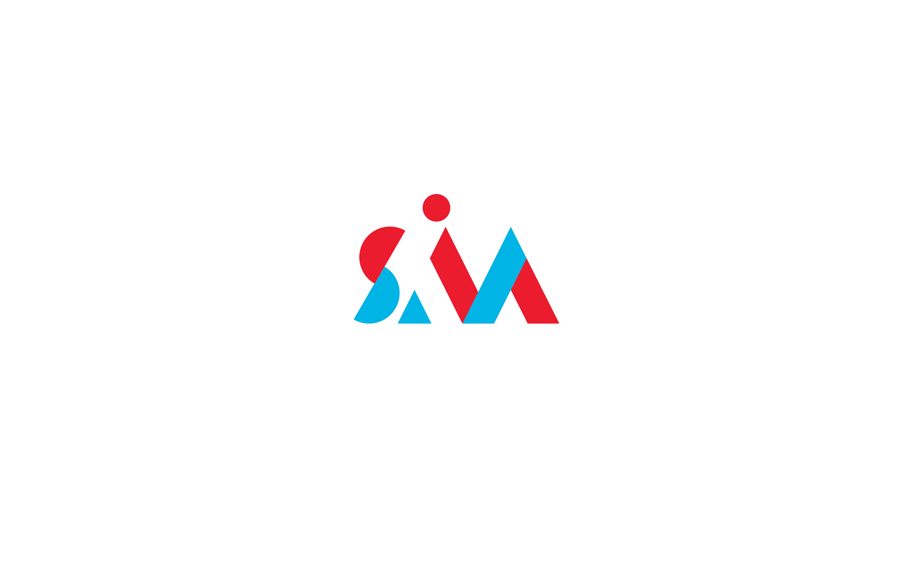
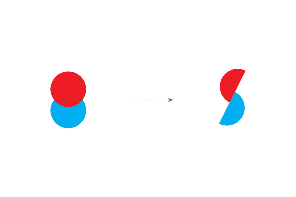
From Singapore to the world. The red within our logo signifies our pride in being born, bred, and based in the little red dot, while the blue represents us reaching out to the world’s learners as we accelerate into the future. The circles represent the well-rounded global curriculum and holistic learning approach provided by SIM Global Education.
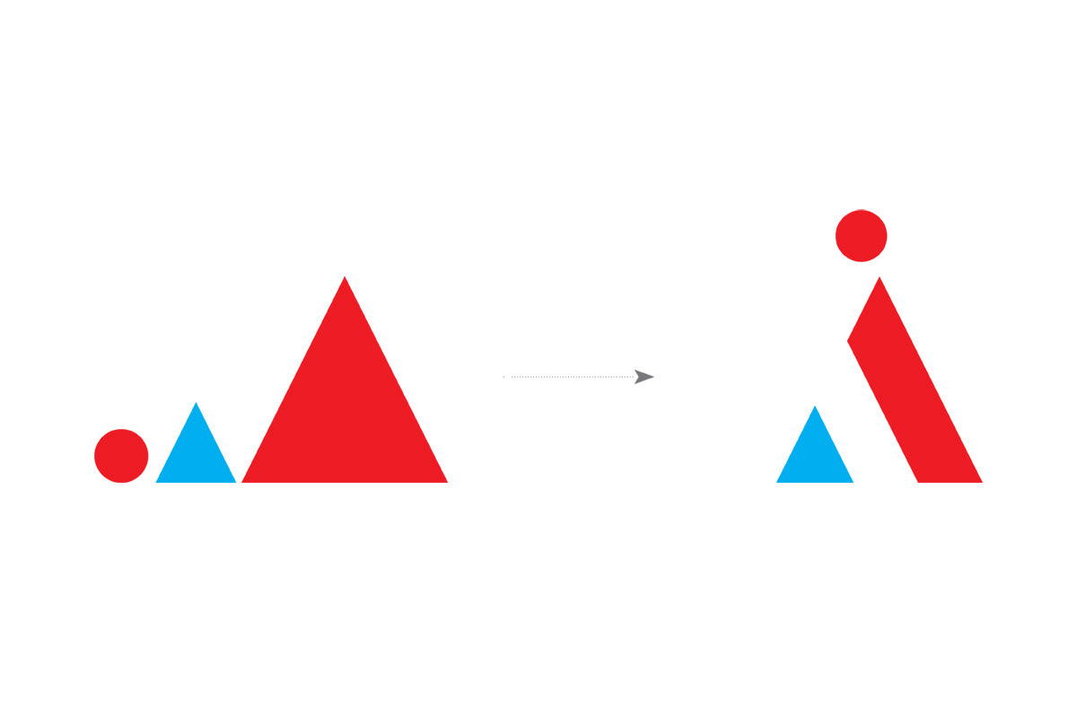
Reaching peak potential. The triangles represent new horizons and fresh aspirations. Learners, as depicted by the dot, can go higher and further in their pursuits by upskilling with SIM Academy (Professional Development).
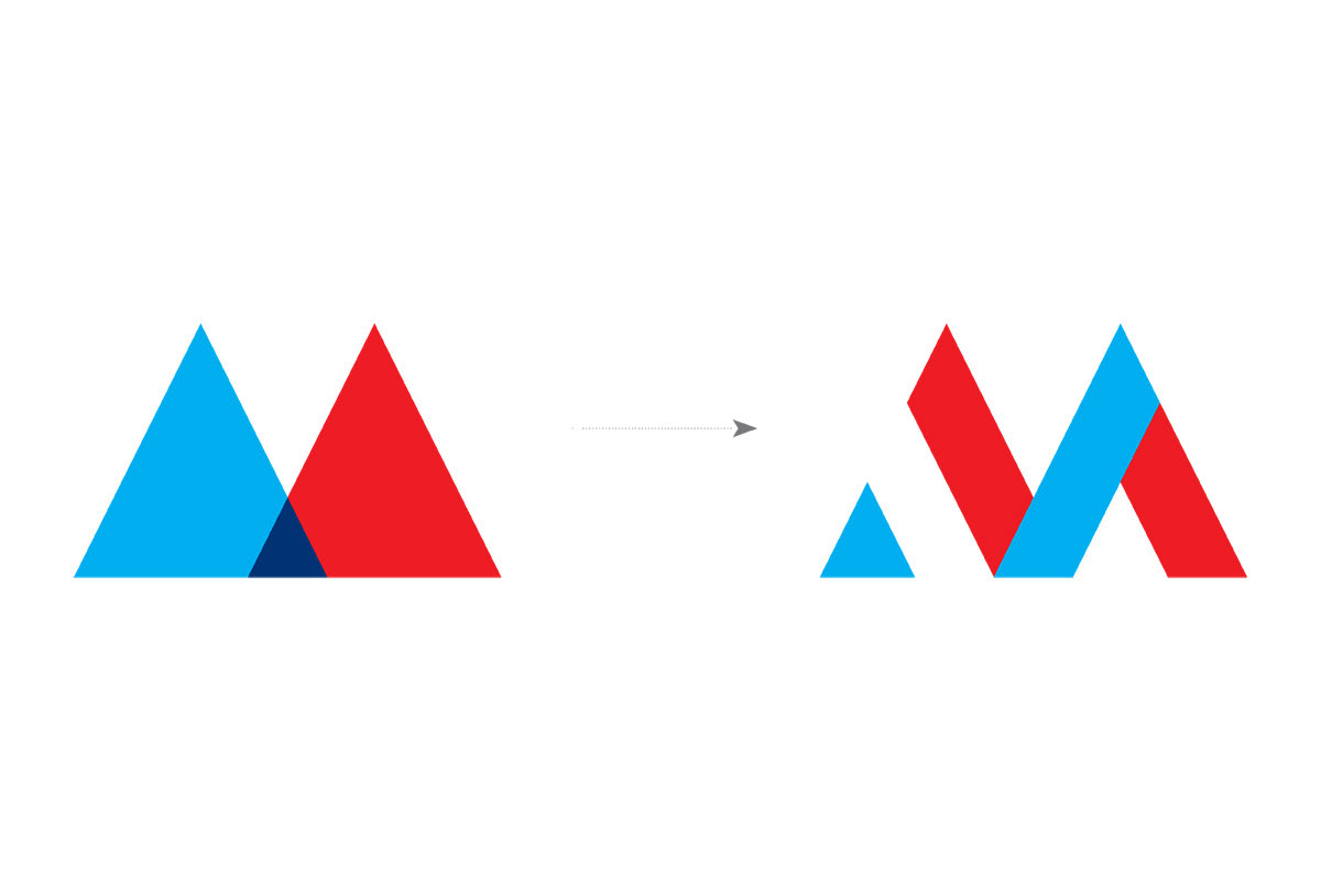
Bridging enterprise learning and corporate excellence. The overlapping triangles depict the collaboration between businesses ready for transformation and a future-ready learning institution at SIM Academy (Enterprise Solutions).
Print & Outdoor
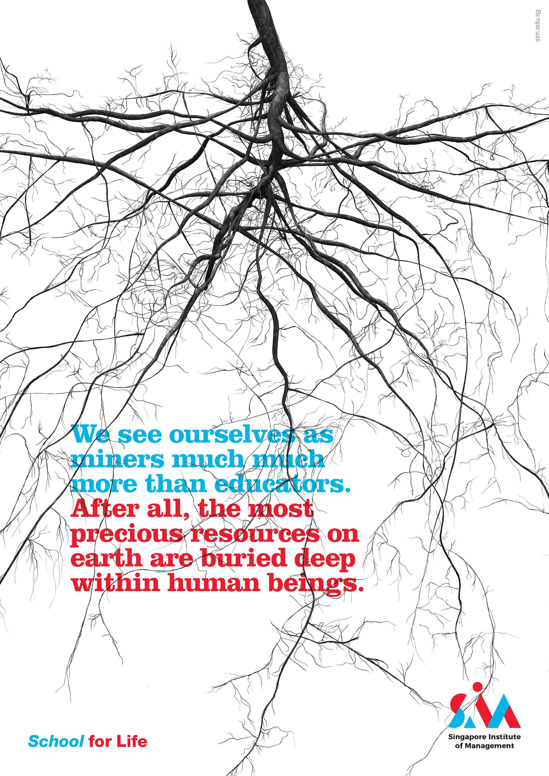
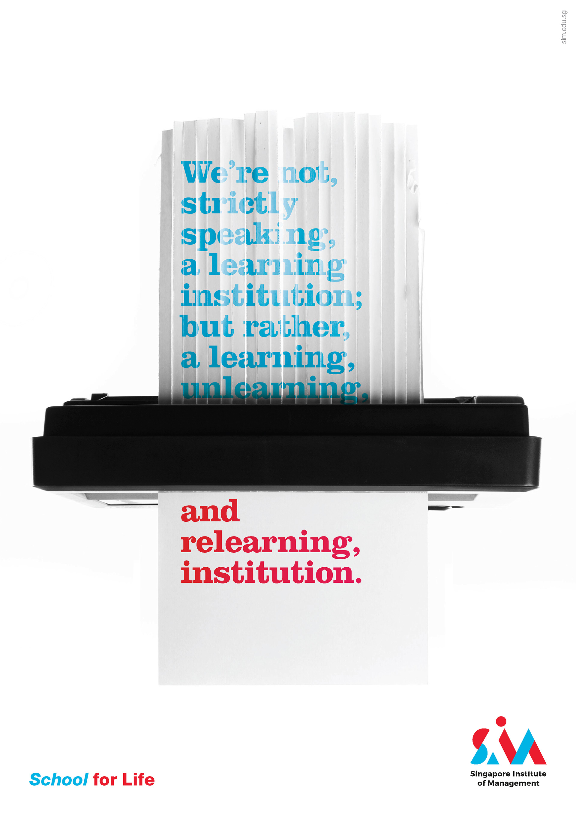
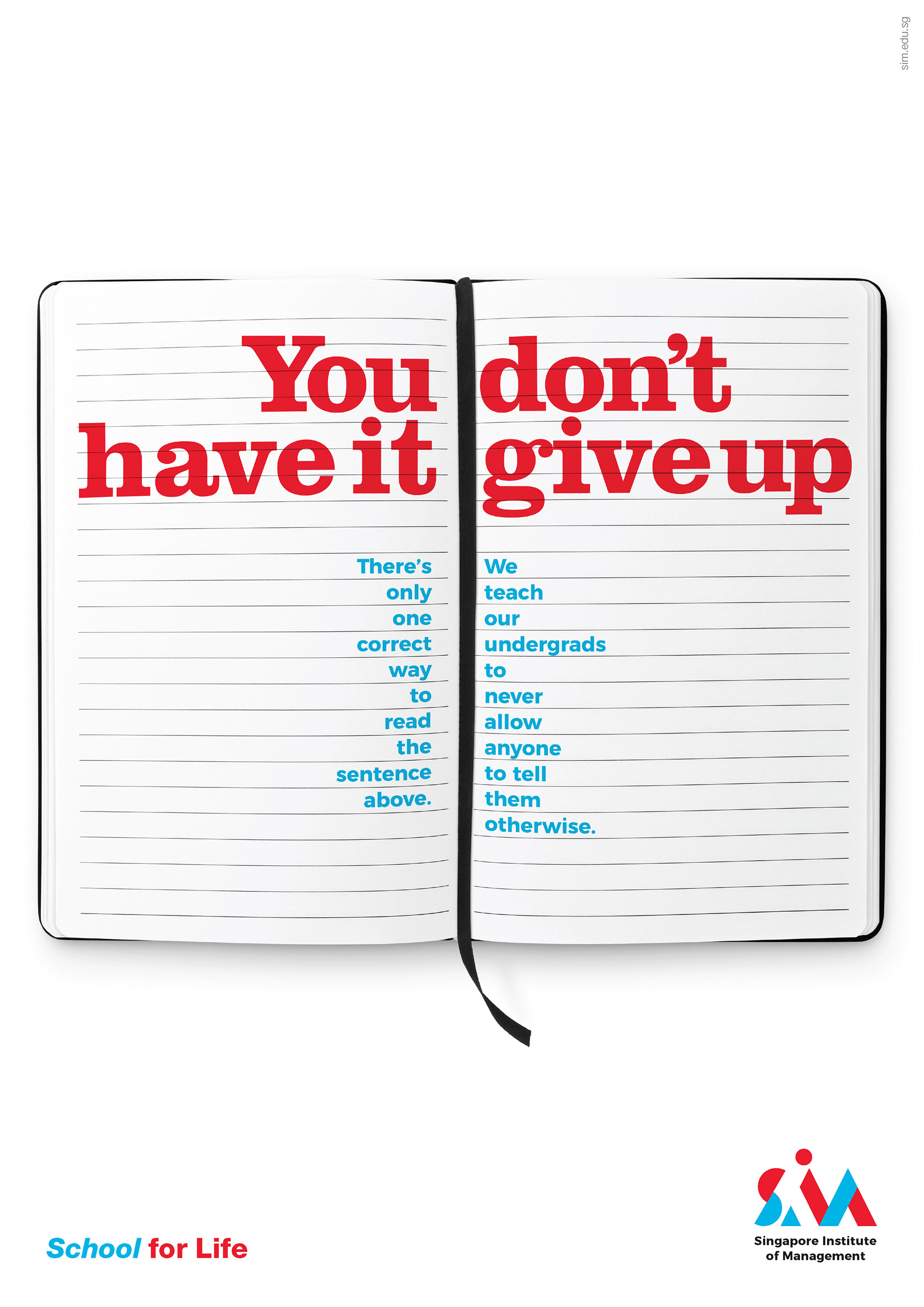
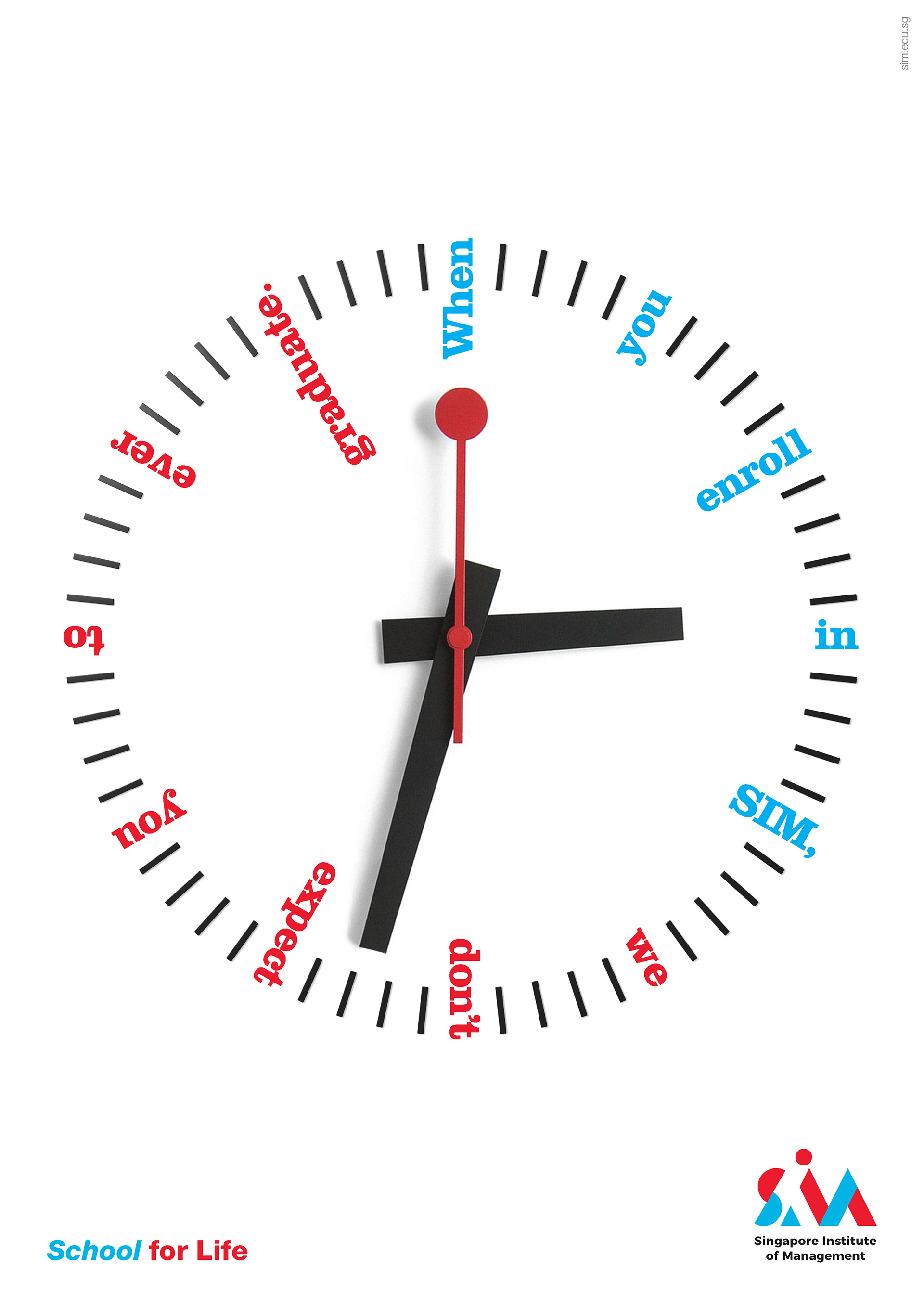
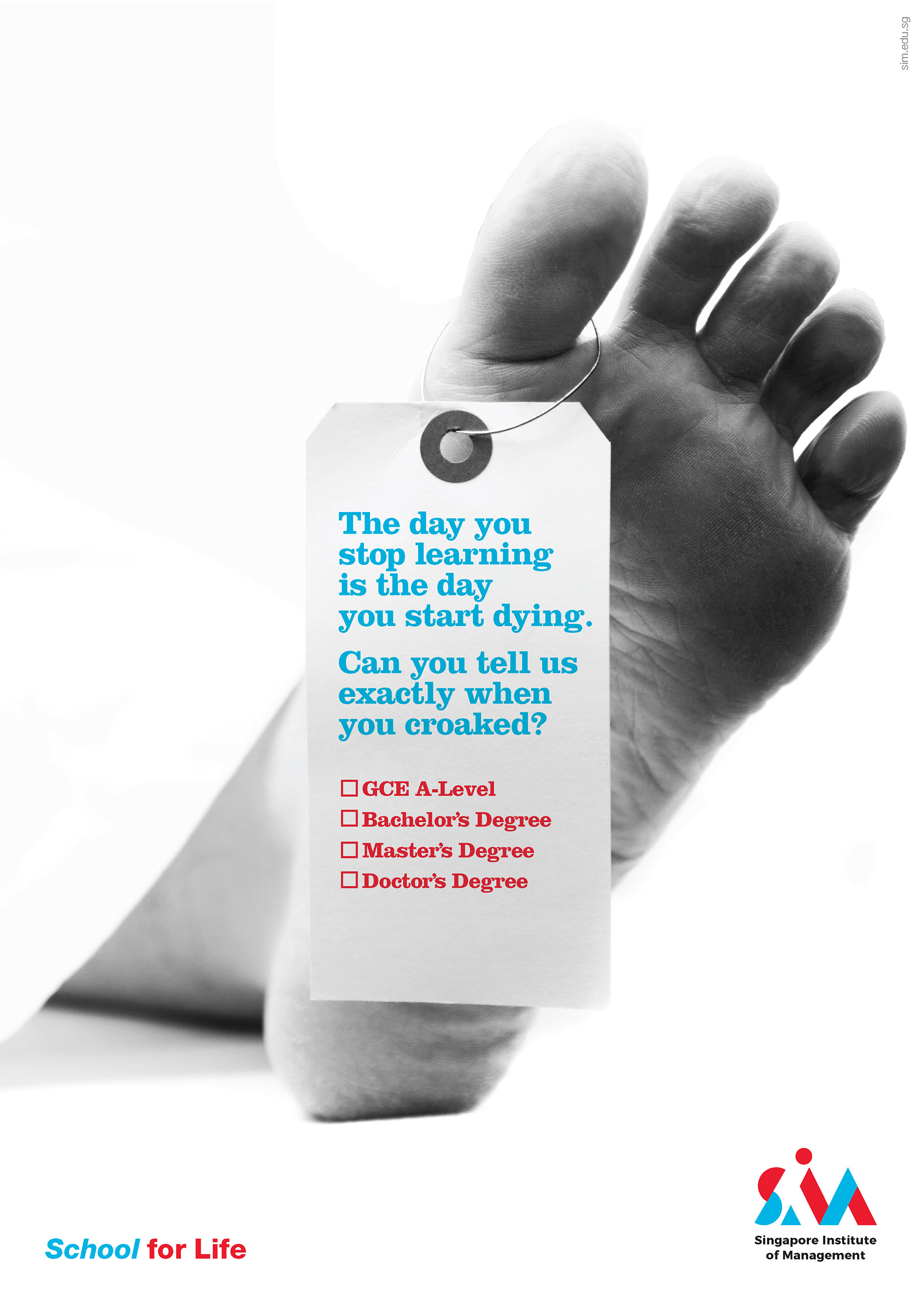
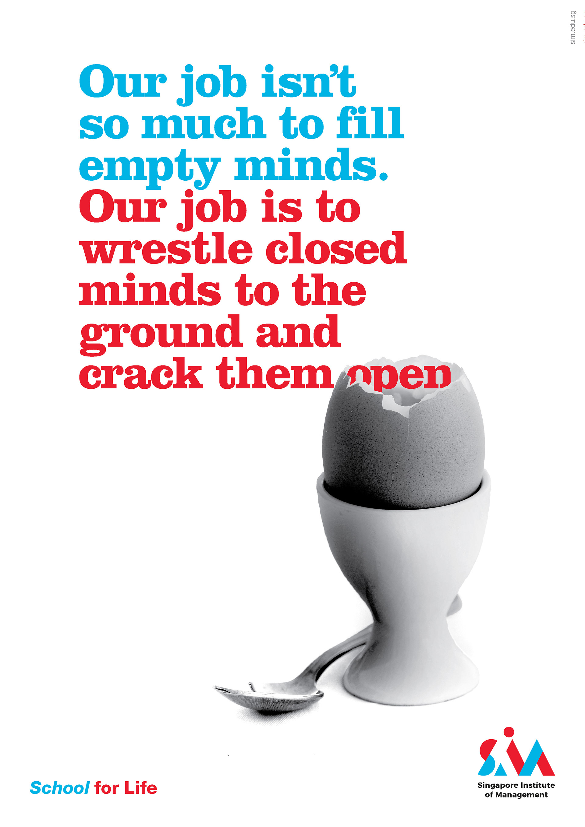
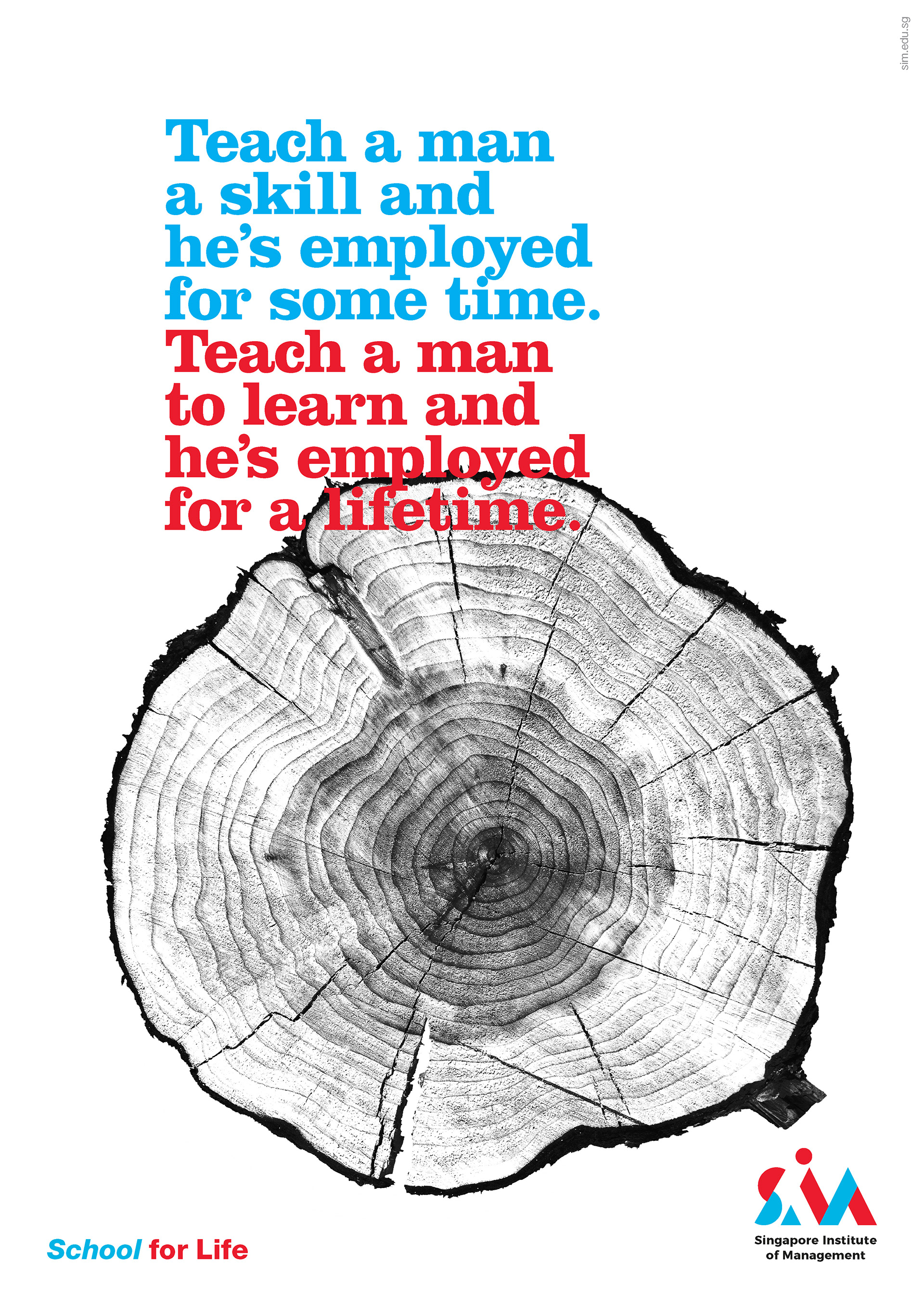
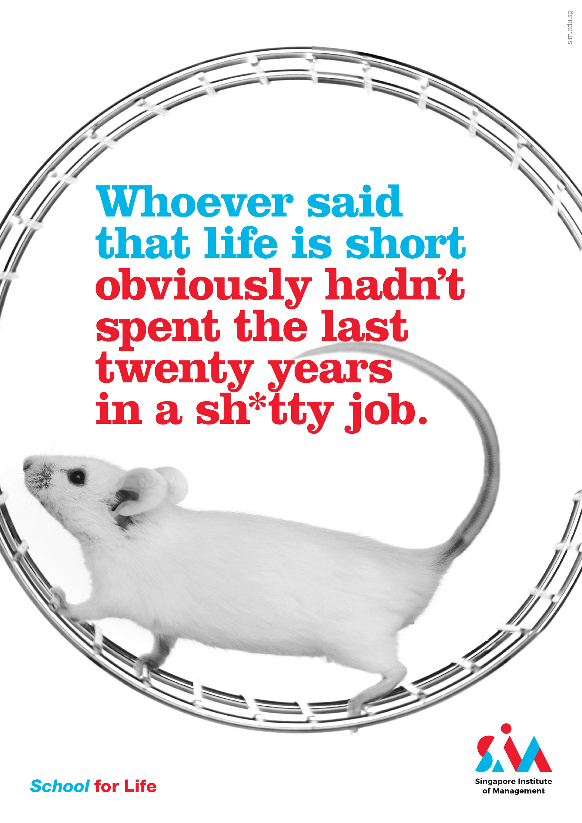
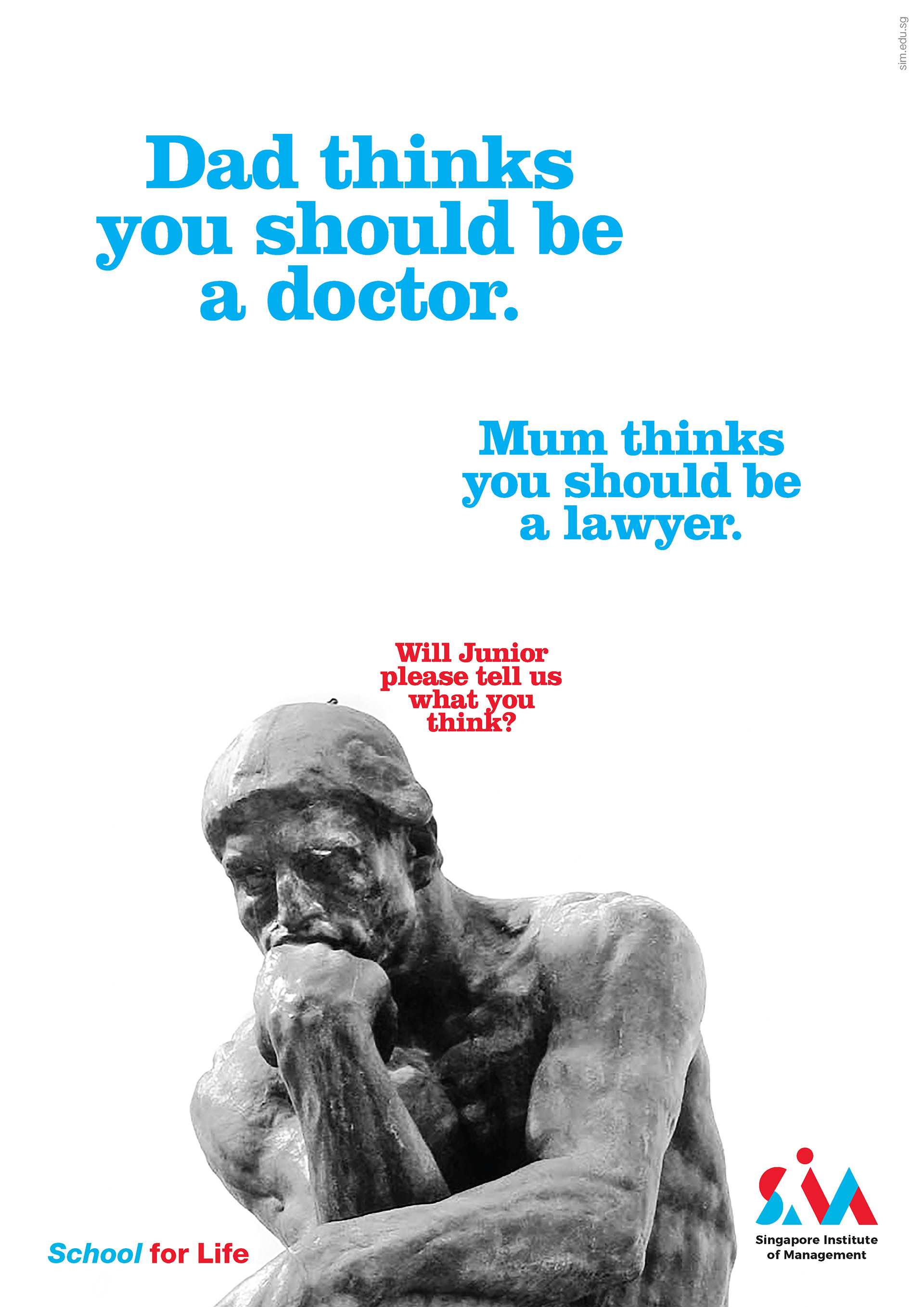
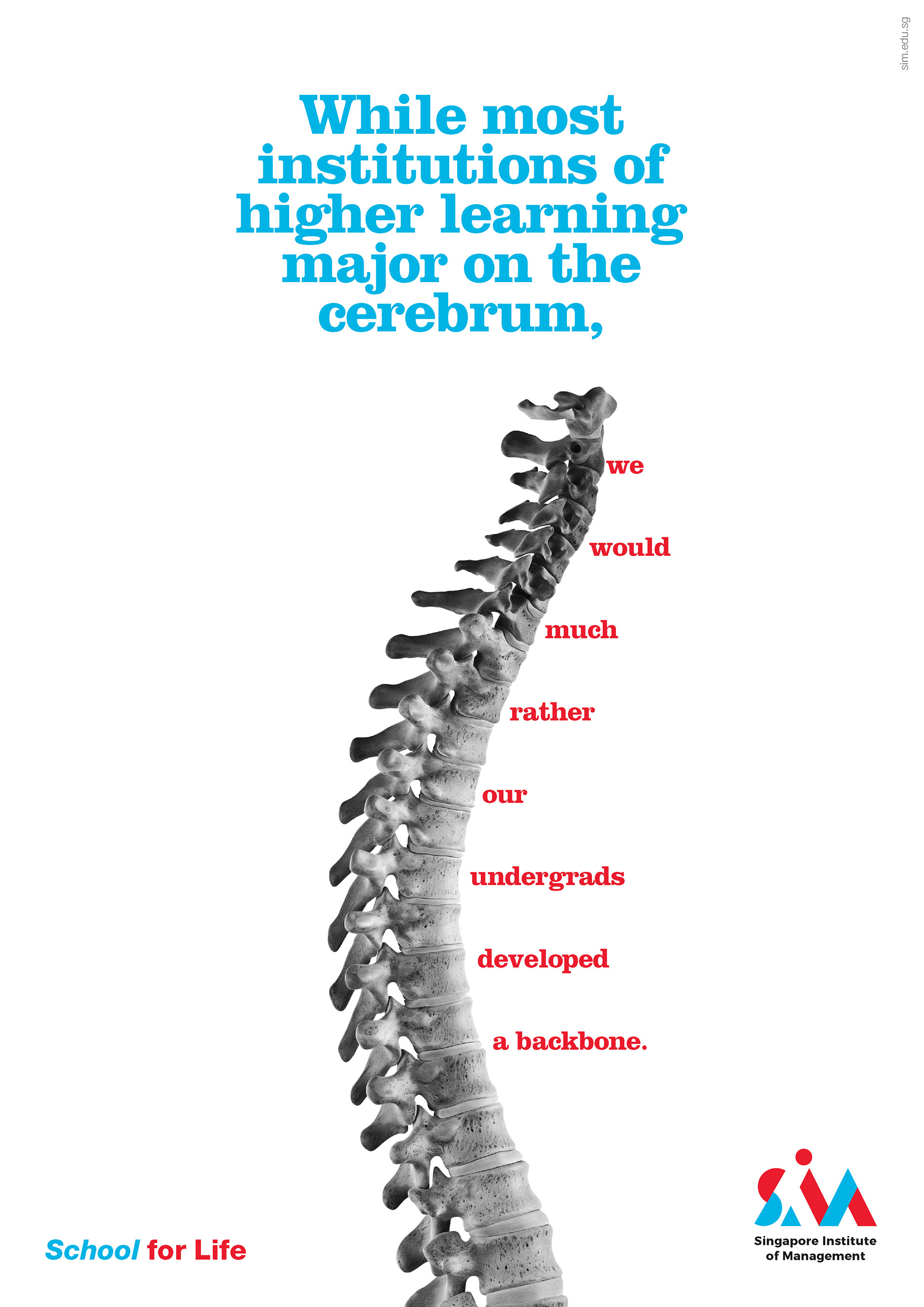
Along with the rebranding, SIM launched a series of print and outdoor campaigns that features the new tagline "School for Life" which sets SIM on a fresh, dynamic trajectory in the future of work and career learning.
When they learn for life with SIM, they are equipped to turn life’s challenges into opportunities. SIM is where learners are nurtured to thrive in life and for life. Is a school for life learning.

The Results
A brave new world ahead calls for a new kind of university, that is more than just a university.
The campaign of course does not stop here – this is only just the beginning.
The campaign of course does not stop here – this is only just the beginning.
Agency: DDB Singapore
Creative Directors: Thomas Yang, Eugene Cheong, Sharon Goh
Head of Art & Design: Thomas Yang
Art & Design Director: Sharon Goh
Copywriter: Eugene Cheong
Photographer: Gettyimages